Simplifying B2B Checkout: A User-Centric Approach
In B2B transactions, the user experience (UX) is often overlooked in favor of sealing deals and exchanging invoices. However, strategic design, especially in a well-designed B2B checkout process, is essential for smoother operations, happier clients, and increased revenue.
In this article, we look at how a UX-led approach can make the B2B buying process convenient, intuitive, and secure.
The Current State of B2B Payment Checkout
Research shows many B2B checkouts are confusing. Late payments and bad debts plague the ecosystem. However, digitization is driving change. B2B payments are evolving, and buyers expect streamlined experiences. The global B2B payment market is estimated to reach $111 trillion by 2027. The time of slow, frustrating business payment experiences is well past its expiry date, it's time to embrace a user-centric lens in the new era of seamless, intuitive, and secure B2B payments.
Tips for Better B2B Payment Checkout UX
1) Fewer Fields, Greater Efficiency
B2B checkout forms can feel like a paperwork marathon. Simplification is the name of the game:
Reduce Mandatory Fields: Let's focus on essential details. Do we really need to collect their company's fax number for a B2B payment? Most likely not. Let's streamline the process to increase efficiency and reduce complexity.
Group Related Information: Combine shipping and billing addresses. This "bundling" technique is efficient and user-friendly. Plus, it minimizes data entry errors.
Autofill Magic: Implement autofill features. Users will appreciate the time saved. A great user experience also means anticipating the user's move, signaling that you're paying attention to them and their needs.
2) Clear Progress Indicators: Guiding the Way
In some B2B checkouts, the process can feel like trying to find your way through a maze blindfolded. There are confusing steps, sometimes no payment confirmation, no expectations set during the payment process, and more.
Improve that by implementing a Step-by-Step Progress Bar, which will provide users with transparent information about their current position and what steps are ahead.
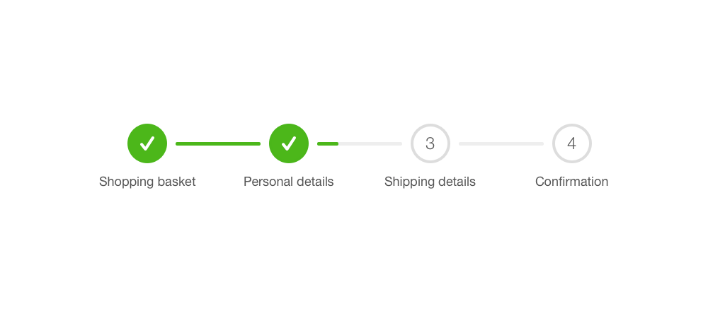
Here's a recurring issue in many B2B payment journeys:
A procurement manager at a large company who is finalizing a substantial order through a B2B platform. The manager encounters multiple steps throughout the checkout process, such as entering shipping and payment details. However, once the payment information is submitted, there is no immediate confirmation or indication of the order processing status.
As a result, the manager is left in the dark about whether the transaction was successful, causing unnecessary anxiety and uncertainty.
By implementing a Step-by-Step Progress Bar in this scenario, the procurement manager would receive clear, real-time updates on each stage of the checkout process.
For instance, they would see a visual indicator showing that the payment has been accepted and the order is being processed.
This transparency and reassurance eliminates doubts about the payment's status, but also streamline the manager's workflow, making the entire B2B checkout process more efficient and dependable.
3) Mobile-Friendly Design: Business on the go
Mobile devices are our constant companions. Ensure your checkout works seamlessly on phones and tablets. Responsive design isn’t jargon; it’s essential:
Mobile Is Everywhere: B2B decision-makers are mobile and expect to conduct business seamlessly while on the go. If your checkout isn’t mobile-friendly, you’re missing out on a growing slice of the revenue pie.
Responsive Design: Create an experience that feels tailor-made. Think of it as a bespoke suit for your checkout process. No awkward fits here.
4) Error Handling with Grace: Oops, Something Went Wrong
Errors happen, especially when it comes to the final step of sending a payment. This is a highly sensitive step that should be handled with grace and transparency.
Instead of cryptic messages, explain clearly:
Instead of seeing a generic "Error 404" message, you receive a message that says something like, "We hit a small bump in the road, but we're on it. Your payment information is saved, please try sending again in 5 minutes."
This approach acknowledges the issue, settles the user's nerves letting them know that the information is saved, and sets the expectation that they can try re-sending again in 5 minutes.
Guidance: Did they forget to fill in their company name? Kindly nudge them. Error handling is like catching a falling glass – do it gracefully. No shattered expectations.
The Business Case for UX Optimization
Tying user experience (UX) design to business objectives is crucial for the success of any company, especially in the context of B2B payments.
To convince the C-Suite of the importance of UX in B2B payments, presenting concrete data on faster approval times, reduced errors, and higher client satisfaction ratings can demonstrate the real impact of UX improvements.
1. Optimizing the B2B checkout process is crucial for speeding up transactions in B2B payments. For instance, simplifying the process can involve integrating systems to automate invoice processing, reducing the time it takes for transactions to be completed and invoices to be paid.
2. By simplifying the checkout process, you can introduce features like saved payment methods and quick order forms, reducing transaction times for clients and increasing efficiency.
For example, implementing a one-click reordering system for frequently purchased items can significantly expedite the checkout process, leading to time savings for both the buyer and seller.
3. A streamlined checkout process can also reduce payment errors and associated costs.
For instance, integrating automatic payment reconciliation capabilities can help identify and rectify errors in payment processing, reducing the likelihood of costly manual intervention and reconciliation efforts.
4. Focusing on optimizing the user experience for B2B payments can help reduce abandoned carts, preventing missed revenue opportunities.
Implementing personalized, localized, and user-friendly interfaces can reduce friction in the payment process, leading to lower cart abandonment rates and greater revenue capture.
5. To convince C-Suite executives of the importance of UX in B2B payments, presenting concrete data on faster approval times, reduced errors, and higher client satisfaction ratings can demonstrate the real impact of UX improvements.
For example, showcasing metrics that illustrate a 20% reduction in payment approval times and a 30% decrease in payment processing errors post-implementation of UX enhancements can provide compelling evidence of the tangible benefits.
The Role of Specialized Partners: WDIR
With WDIR, you get UX experts who focus exclusively on improving B2B payment processes to guide you through the new B2B payments era. WDIR is trusted by leading financial institutions like American Express and innovative Fintechs around the world to create seamless, intuitive, and secure business payment experiences. Get in touch today!